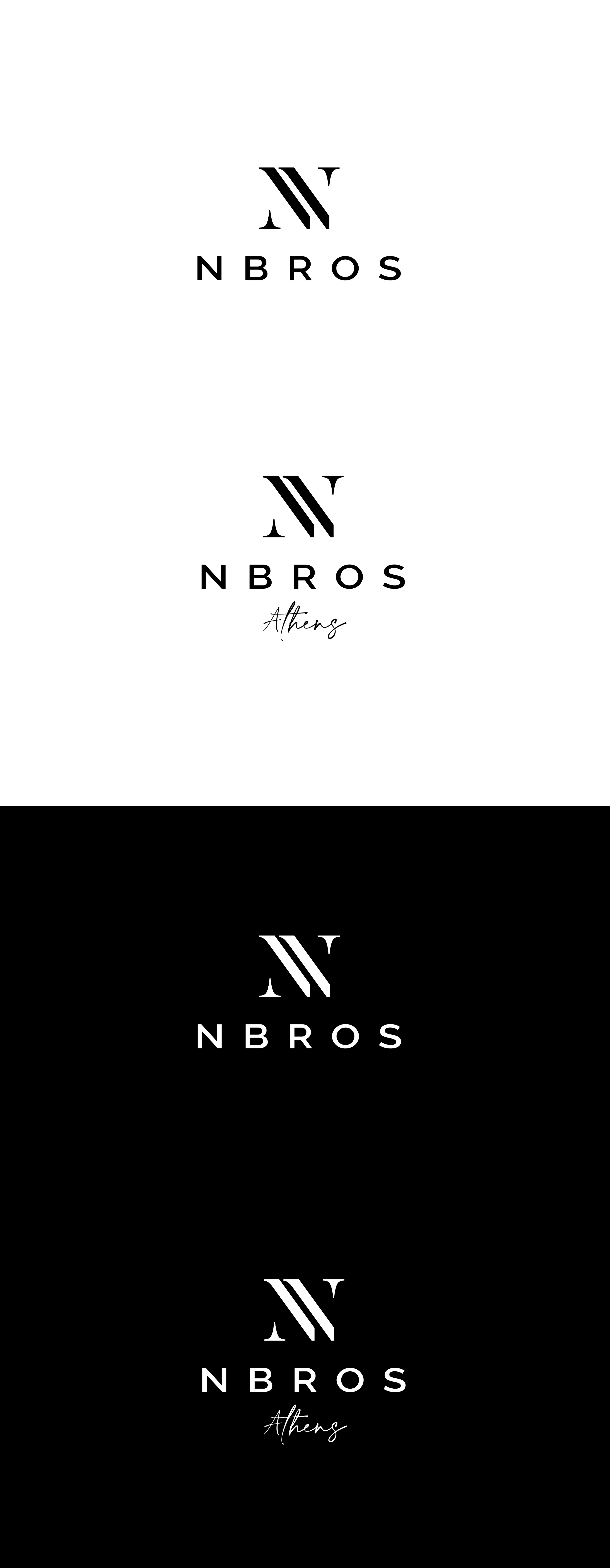
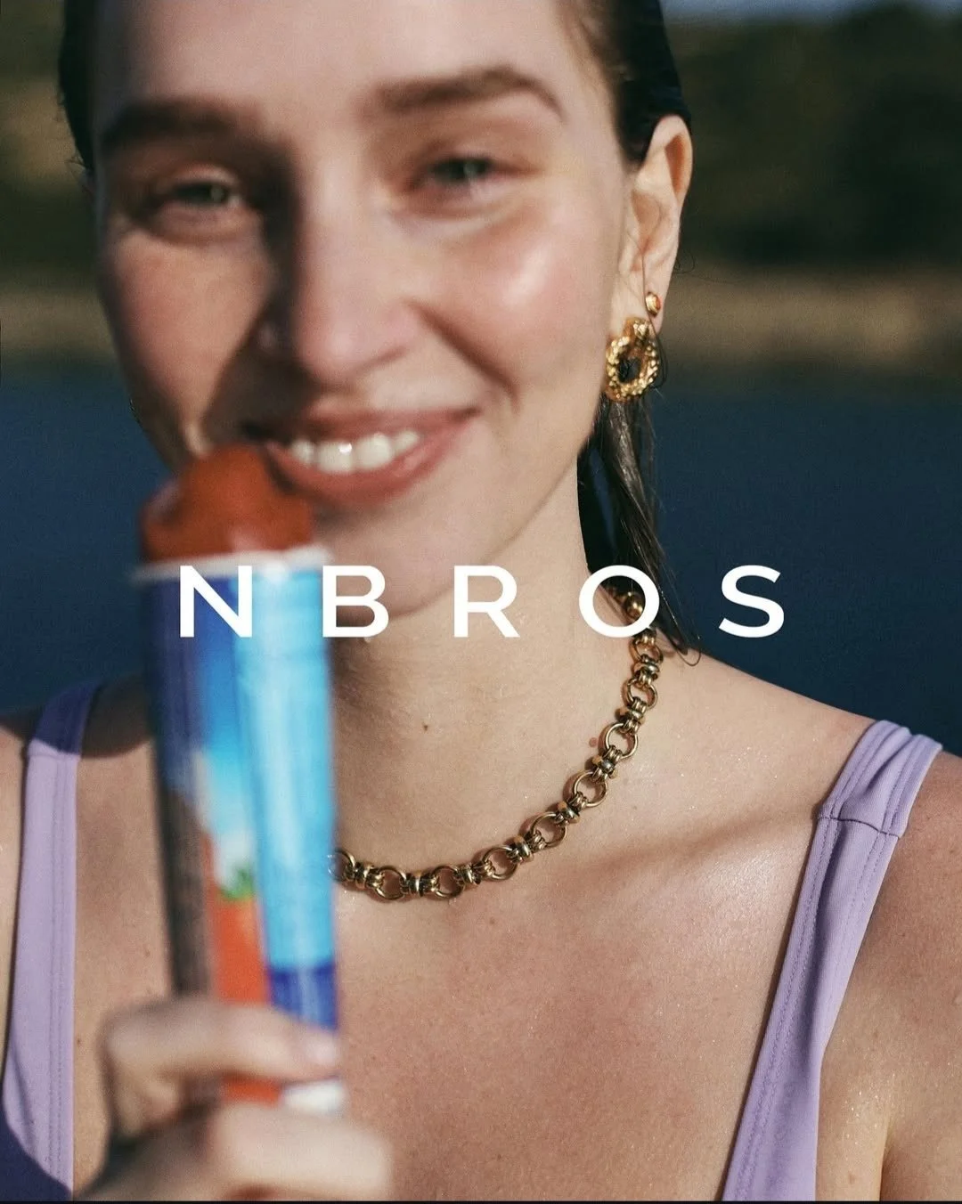
NBROS Handmade Jewellery visual identity refresh
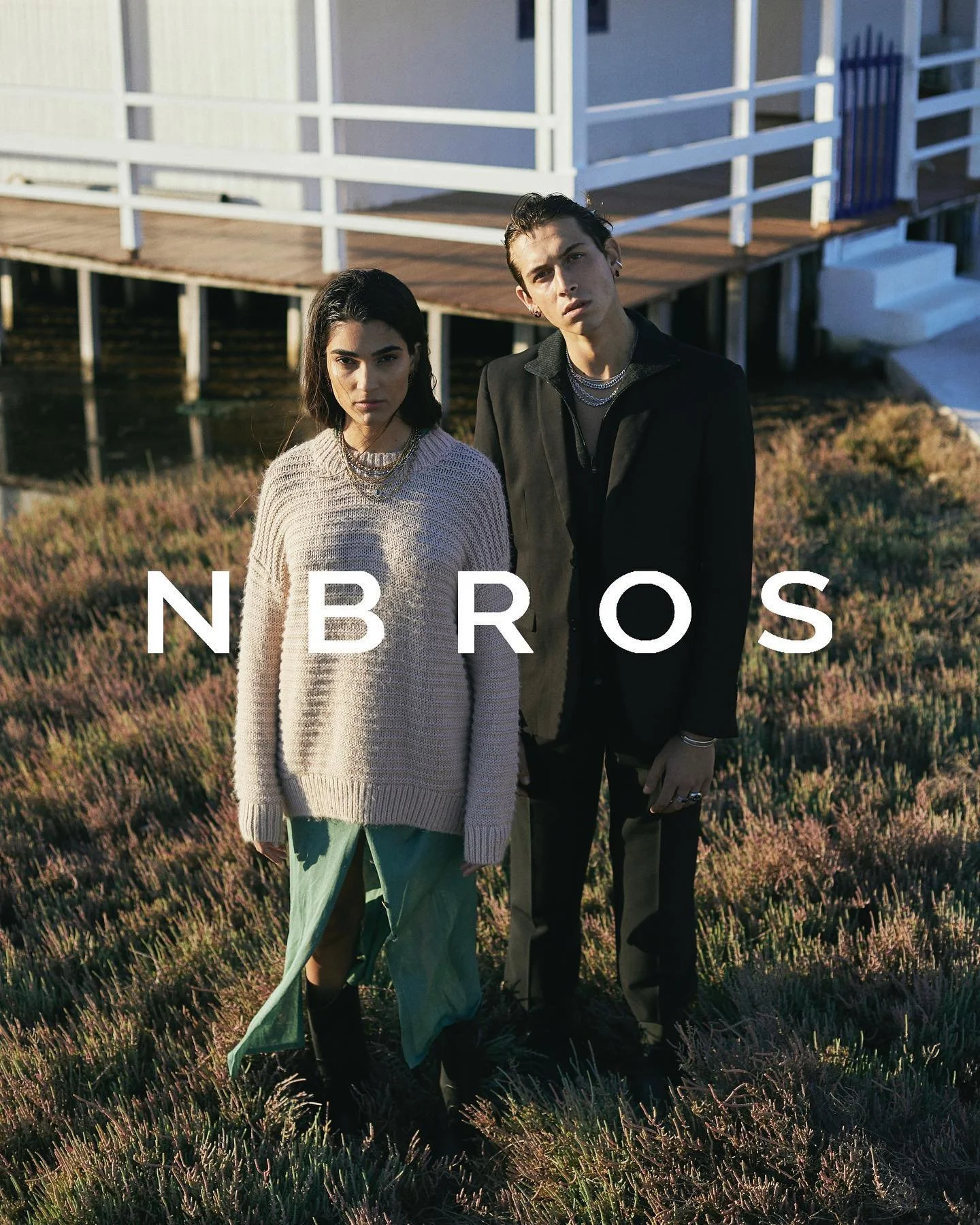
NBROS Handmade Jewellery is a Greek jewellery brand founded by brothers Haris and Spyros Nitsios. As the brand continued to grow its online presence and product range, I was commissioned to refresh its visual identity, creating a more refined and versatile logo system that better reflected the quality of the products and the brand's evolving position in the market.
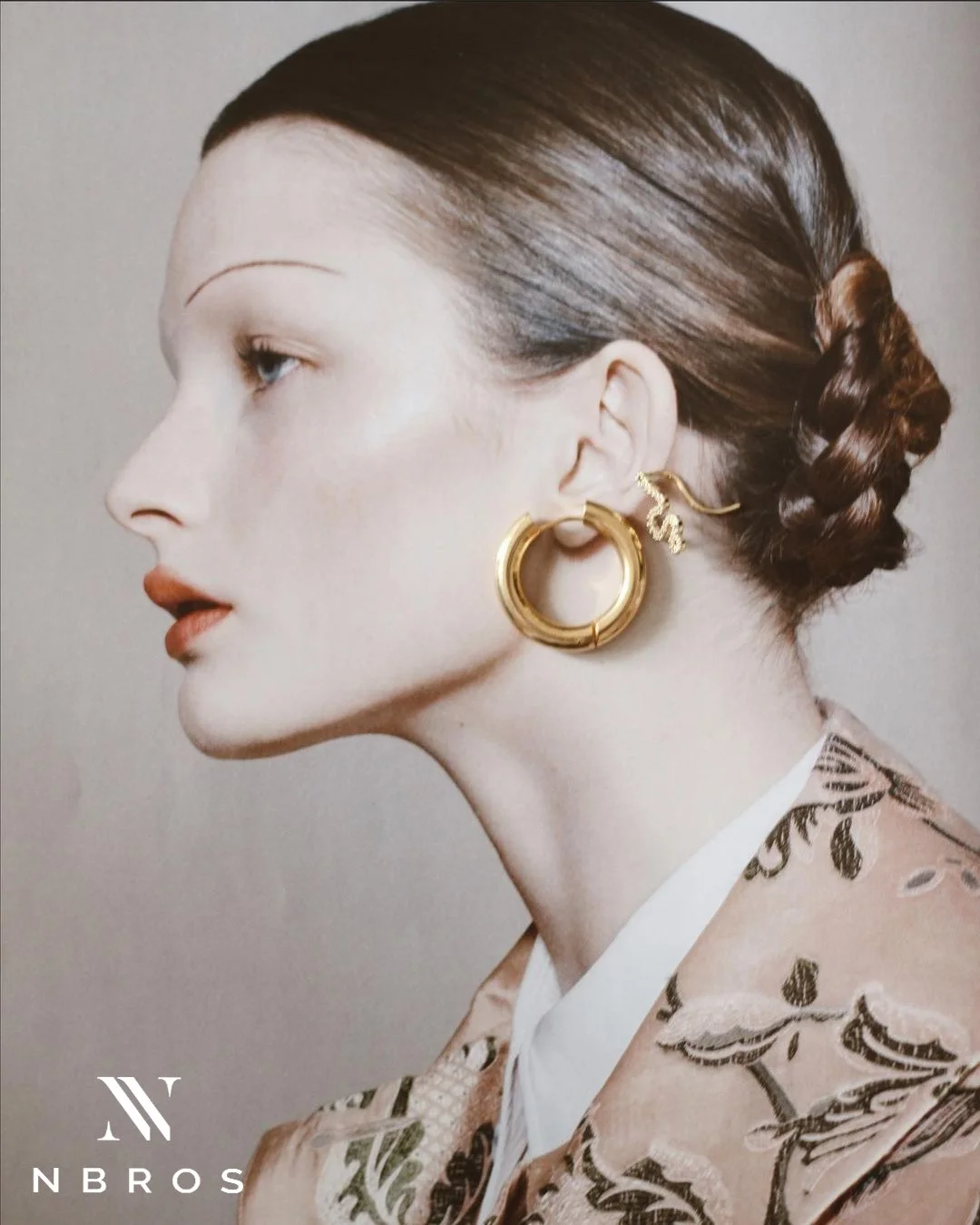
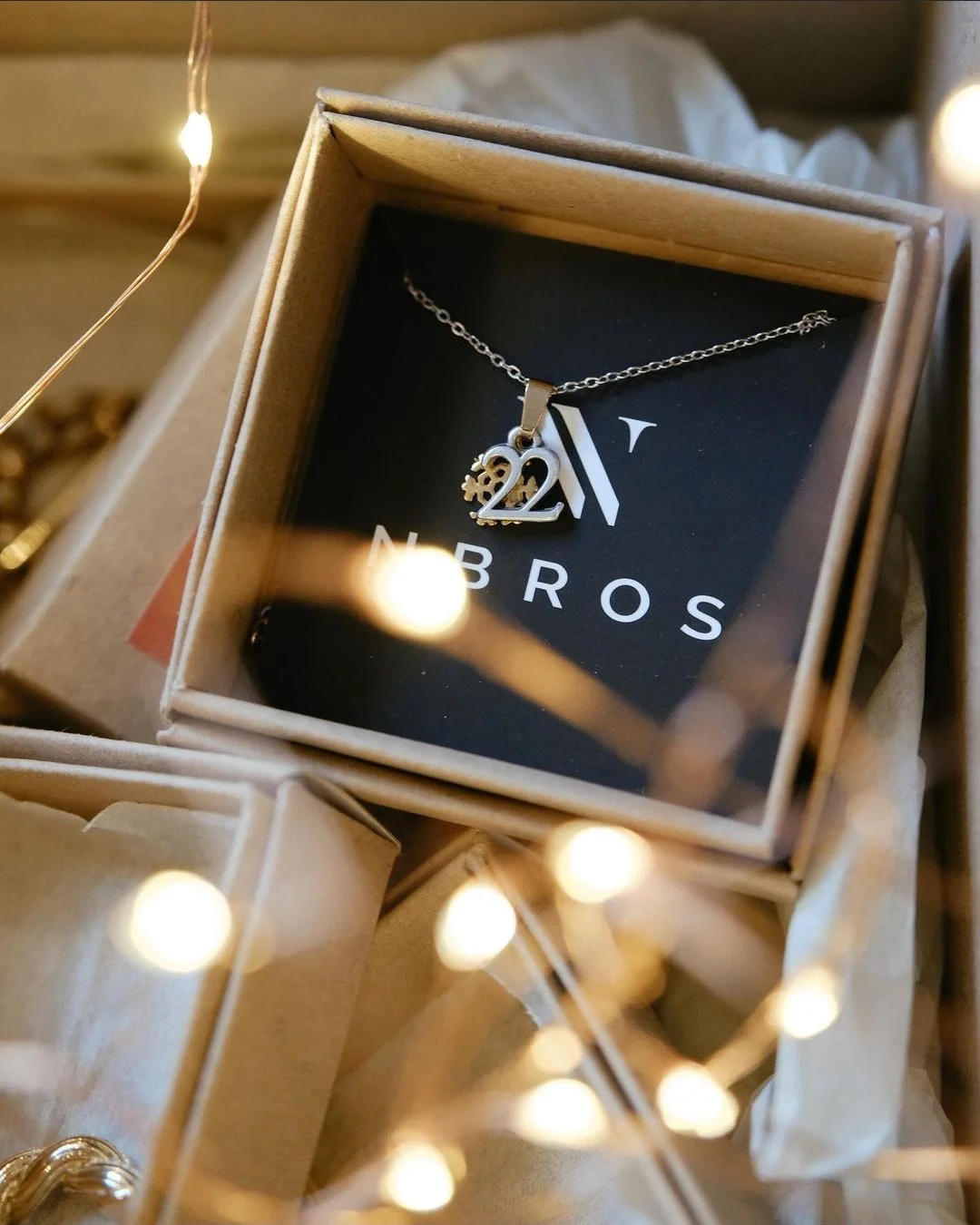
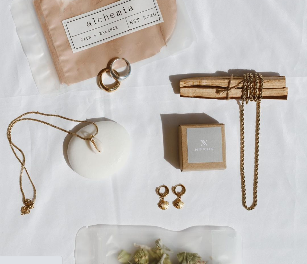
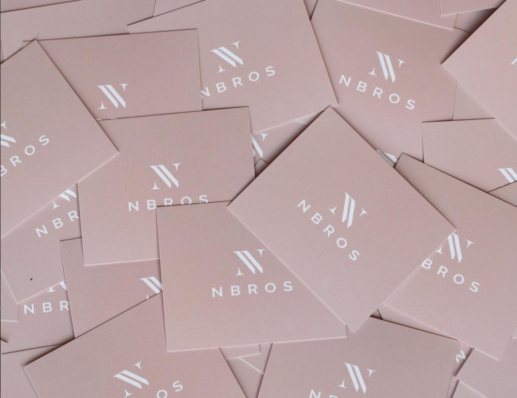
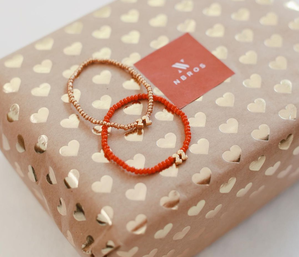
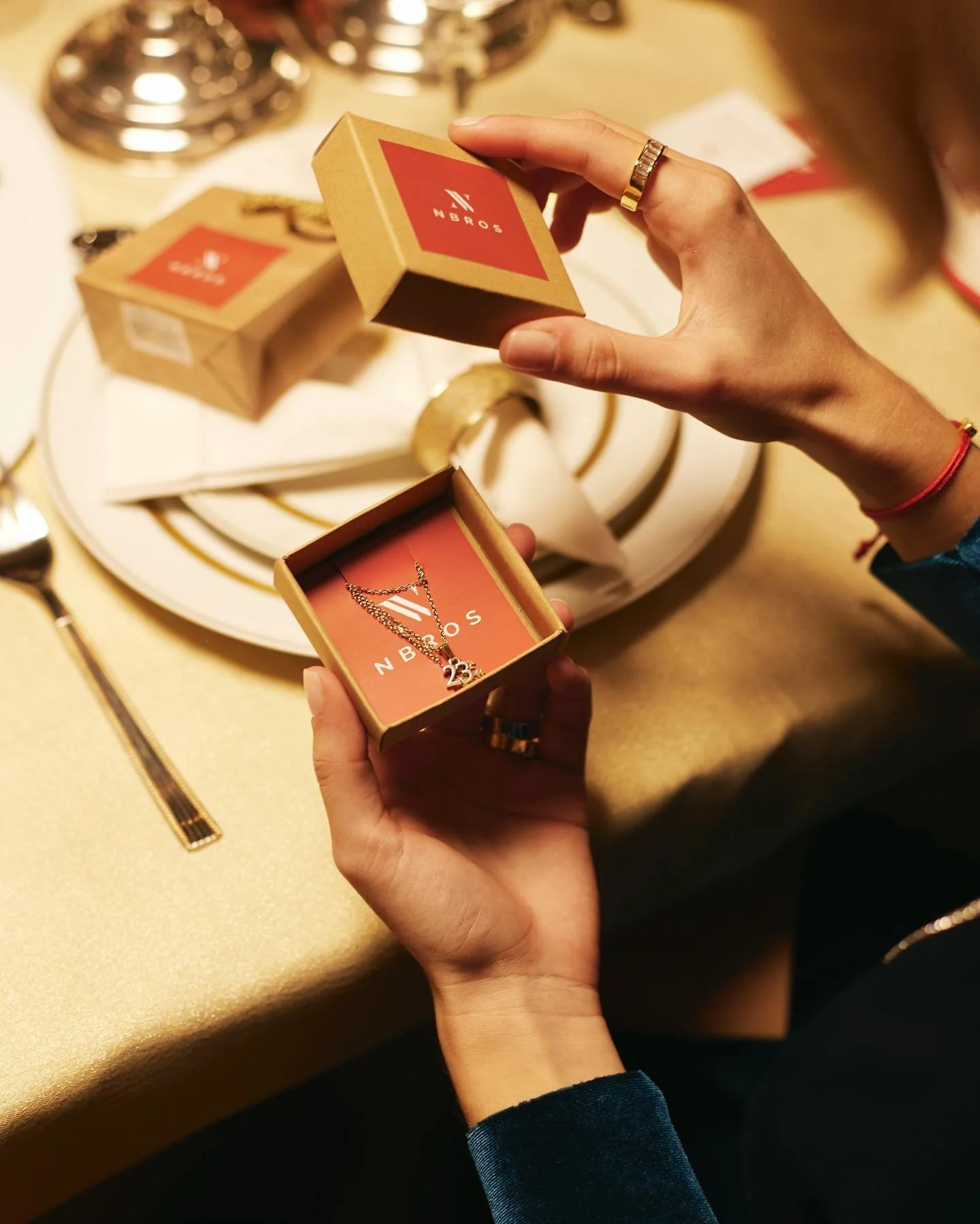
The project included the development of a new typographic identity, logo refinements and supporting brand applications across business stationery and merchandise. Working closely with the founders, the final identity established a stronger visual foundation that could be applied consistently across digital and print touchpoints while maintaining a clean, contemporary aesthetic.
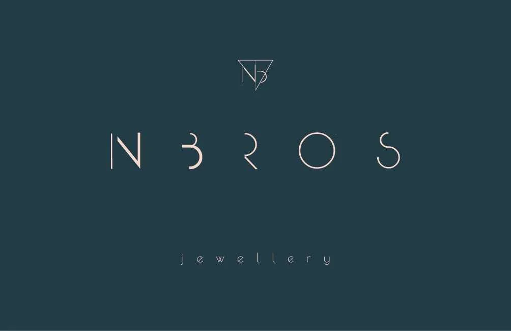
Previous NBROS logo before the visual identity refresh.
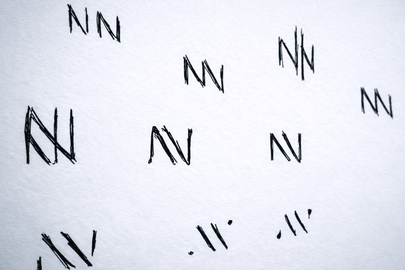
Early NN monogram explorations, testing proportion and stroke weight.